
Power BI Dashboard to Keep Track of Your Projects
- A single, up-to-date overview of key project KPIs
- Combine data from various project and business systems
- Move from manual reporting to targeted management
From Fragmented Project Data to a Clear Overview
Project organizations have access to an ever-increasing amount of data. However, more data does not automatically mean more insight. For example, the schedule is managed in Primavera P6 or Microsoft Project, financial data comes from an ERP system, documents are managed in SharePoint or Aconex, and hours are tracked elsewhere.
To create a project report, information from these various sources must then be manually collected and combined. This takes time and makes it more difficult to work from a single, up-to-date, and reliable overview throughout the project.
Recognizable?
- Project data is scattered across various systems
- Reports are created manually in Excel
- Deviations in scheduling or costs do not become apparent until late in the process
- The project team and management do not always work with the same information
With a Power BI project dashboard, you can bring together relevant information and provide a visual and interactive overview of your project data.
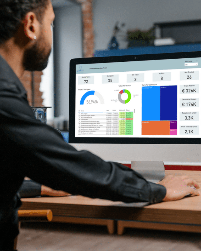
What is a Power BI project dashboard?
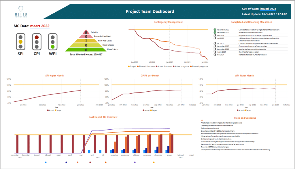
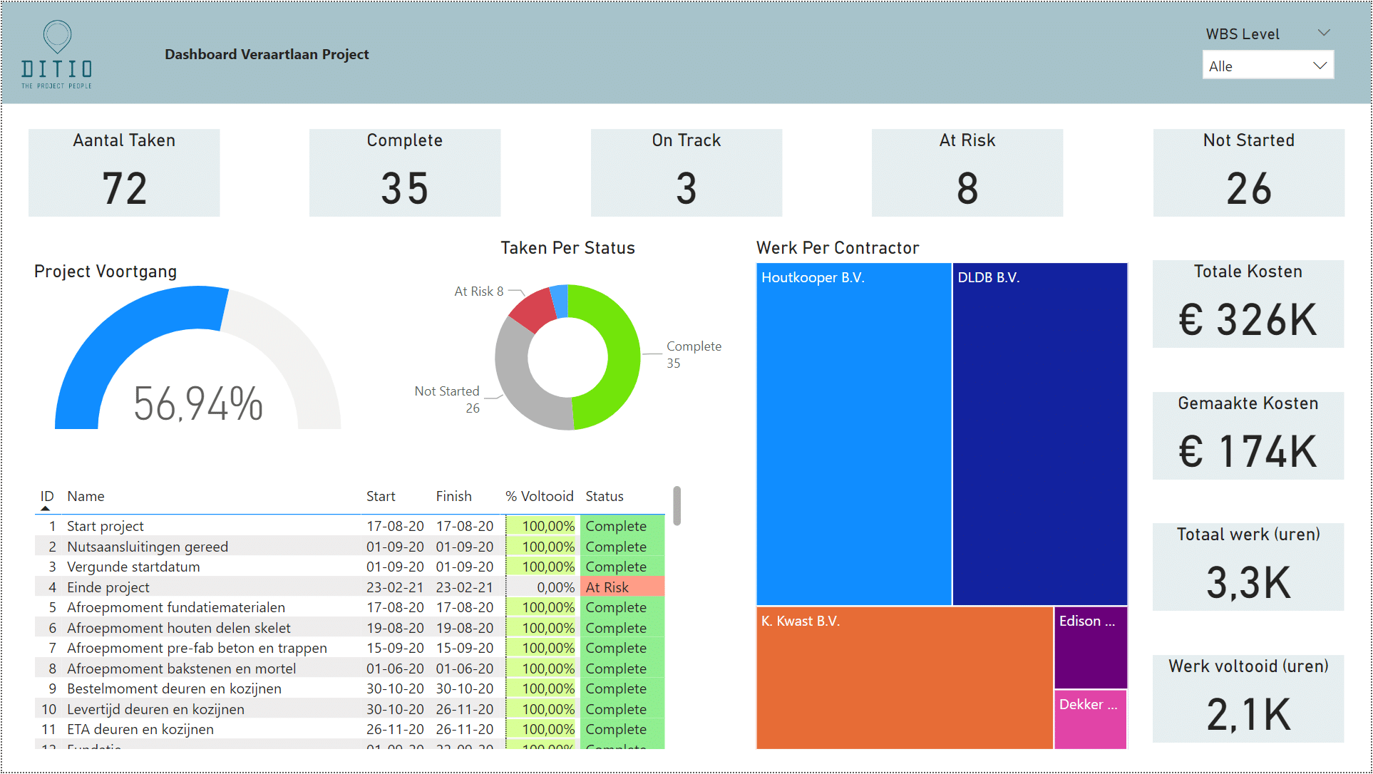
A Power BI project dashboard is a visual overview that brings together key project information and KPIs. Instead of separate spreadsheets and reports, you get a single environment where you can track, for example, the schedule, costs, progress, capacity, and risks.
The information displayed in the dashboard depends on the project and the information needs. For example, a project manager wants to be able to quickly see where the schedule is off track, while a program manager or executive leadership may need an overview of multiple projects.
That’s why at Ditio, we don’t start by building charts; we start with the question: What information do you need to better manage your project?
From Excel Reports to a Power BI Dashboard
In many project organizations, Excel is still an important part of the reporting cycle. There’s nothing wrong with that in itself. The challenge arises when each report has to be manually compiled from different files and systems every time.
Not only does this take time, but it also increases the likelihood that information will become outdated or be interpreted differently.
With Power BI, relevant data sources can be consolidated and data can be updated automatically, where technically possible. This creates a centralized reporting system in which the project team and management all have access to the same information.
As a result, you'll spend less time collecting and processing data and can focus more on what the numbers mean for the project.
What project information can you make available?
A Power BI dashboard is set up based on the KPIs and information relevant to your project organization. This helps us avoid a dashboard full of numbers that, in the end, no one uses to guide their decisions.
Planning and Progress
This makes it easier to identify where delays are occurring and where action is needed.
Costs and Returns
Capacity and Productivity
Risks and Project Management
This turns reporting into a tool for steering the project rather than just a review of the past period.
Combining data from various project and business systems
A key advantage of Power BI is that it allows you to consolidate information from various data sources. This means you don't have to completely overhaul your entire project environment just to gain a better overview.
Within project organizations, relevant data may come from, for example:
- Primavera P6 or Microsoft Project for scheduling
- SAP or other ERP systems for financial information
- SharePoint or Aconex for document and project information
- Exact or other time-tracking systems
The data we can make available and how it can be updated depend on the systems used, the available data, and the technical setup.
We therefore determine in advance what information is needed, where that information is located, and what relationships need to be established between the various data sources.
Not more data, but rather knowing where action is needed
A dashboard is only valuable if it helps you make better decisions. The goal, therefore, is not to cram as much data as possible onto a single screen.
A well-designed project dashboard actually helps you get answers to questions like these more quickly:
- Are we still on schedule?
- Where do abnormalities originate?
- How are costs and the budget changing?
- Is the available capacity sufficient?
- What risks require attention at this time?
- In which areas do we need to make adjustments?
That’s why we determine in advance not only which KPIs should be visible, but also which indicators are important for your project organization.
This creates an overview that not only provides reports but also actively supports project management.
Power BI for a Single Project and Multiple Projects
Power BI can be used to manage a single project, as well as programs and project portfolios.
Within a single project, you can examine details such as scheduling, costs, capacity, and risks. When multiple projects are brought together, you gain insight at a higher level.
For example, a program manager or executive team can compare projects, identify trends, and more quickly spot where deviations or risks are emerging.
This helps to develop a consistent approach to reporting and managing across different projects.
Your own project dashboard in 5 steps
Introduction and inventory
Let's start with the information needs. What questions do you want the dashboard to answer? Which KPIs do you want to use to guide your decisions? Who will be using the dashboard, and what information do these users need?Identifying Data Sources and Opportunities
Next, we identify where the necessary data is located and how it can be made accessible. We determine which systems and files are needed and what relationships need to be established between the data.Based on this, you will receive a proposal and a cost estimate.
Retrieving and Preparing Data
We organize the necessary data and prepare it for use in Power BI. Whenever possible, we set up data flows and automatic refreshes so that the dashboard can operate with up-to-date data.Building a Power BI Dashboard
We build the dashboard using the available datasets. In doing so, we focus not only on the visualization, but above all on readability and usability. Significant anomalies and points of concern must be easily recognizable.During feedback sessions, we test the dashboard with future users and refine it as needed.
Implementation and Further Development
Once the project is delivered, the dashboard can be put into use within the project organization. If information needs change or new data sources become available, the dashboard can be further developed.If certain data sources cannot be automatically integrated, we will work with you to find a suitable approach to keep the information up to date.
Frequently Asked Questions About Power BI Project Dashboards
How much does a Power BI project dashboard cost?
The costs depend on the information requirements, the number of data sources, the necessary integrations, and the complexity of the dashboard. That is why, during the assessment phase, we first identify the desired KPIs, users, and available data. Based on that, we can provide an appropriate cost estimate.How up-to-date is the information in a Power BI dashboard?
That depends on the data source and the chosen configuration. If a source can be accessed automatically, data can be refreshed at agreed-upon intervals. If automatic access is not possible, a different process can be set up to update the information periodically.How is it determined what appears on the dashboard?
We start by identifying users' information needs. What decisions do they need to be able to make, which KPIs are relevant to those decisions, and what project data is available? Based on that, we determine which data and visualizations are needed in the dashboard.Which systems can be connected to a Power BI project dashboard?
That depends on the technical environment. For example, project data may come from Primavera P6, Microsoft Project, SAP, SharePoint, Aconex, Exact, and other project or business systems. We determine in advance which data is needed and how it can be technically accessed.Is a Power BI dashboard suitable for multiple projects?
Yes. A Power BI dashboard can be set up for a single project, but also for multiple projects at the program or portfolio level. This makes it possible, for example, to compare progress, costs, capacity, and risks across projects.Can a Power BI dashboard replace Excel reports?
Power BI can replace a large portion of manual Excel reporting if the necessary data can be properly accessed and structured. As a result, project information needs to be collected manually less often, and reports can be updated more consistently and, where possible, automatically.Can Power BI combine data from different systems?
Yes. Power BI can consolidate data from various data sources. Within project organizations, for example, this might include information from planning systems, ERP systems, document management systems, and time tracking systems. The available integrations depend on the systems used and the technical setup.Which KPIs can you include in a Power BI project dashboard?
Which KPIs are relevant depends on the project and the information needs. Examples include budget versus actual costs, revenue, project margin, planned versus actual progress, milestones, capacity, productivity, and project risks. The basic principle is that a KPI must contribute to the management of the project.What is a Power BI project dashboard?
A Power BI project dashboard visually consolidates relevant project data into a single overview. This includes information on scheduling, progress, costs, capacity, and risks. This allows project teams and management to quickly see where a project is on track and where adjustments are needed.Together also make your project resilient?
Prefer direct contact?
An appointment is easy and completely non-binding.